Naming, identity, visual language and web design for a company specialized in the installation of electric vehicle chargers.
The change in sustainable mobility is a clear reality and electric vehicle models are growing in the market. Following this trend, a company specialized in providing service and assistance to vehicles and service stations throughout the peninsula, commissioned us to create the brand for a new electric charger installation service.

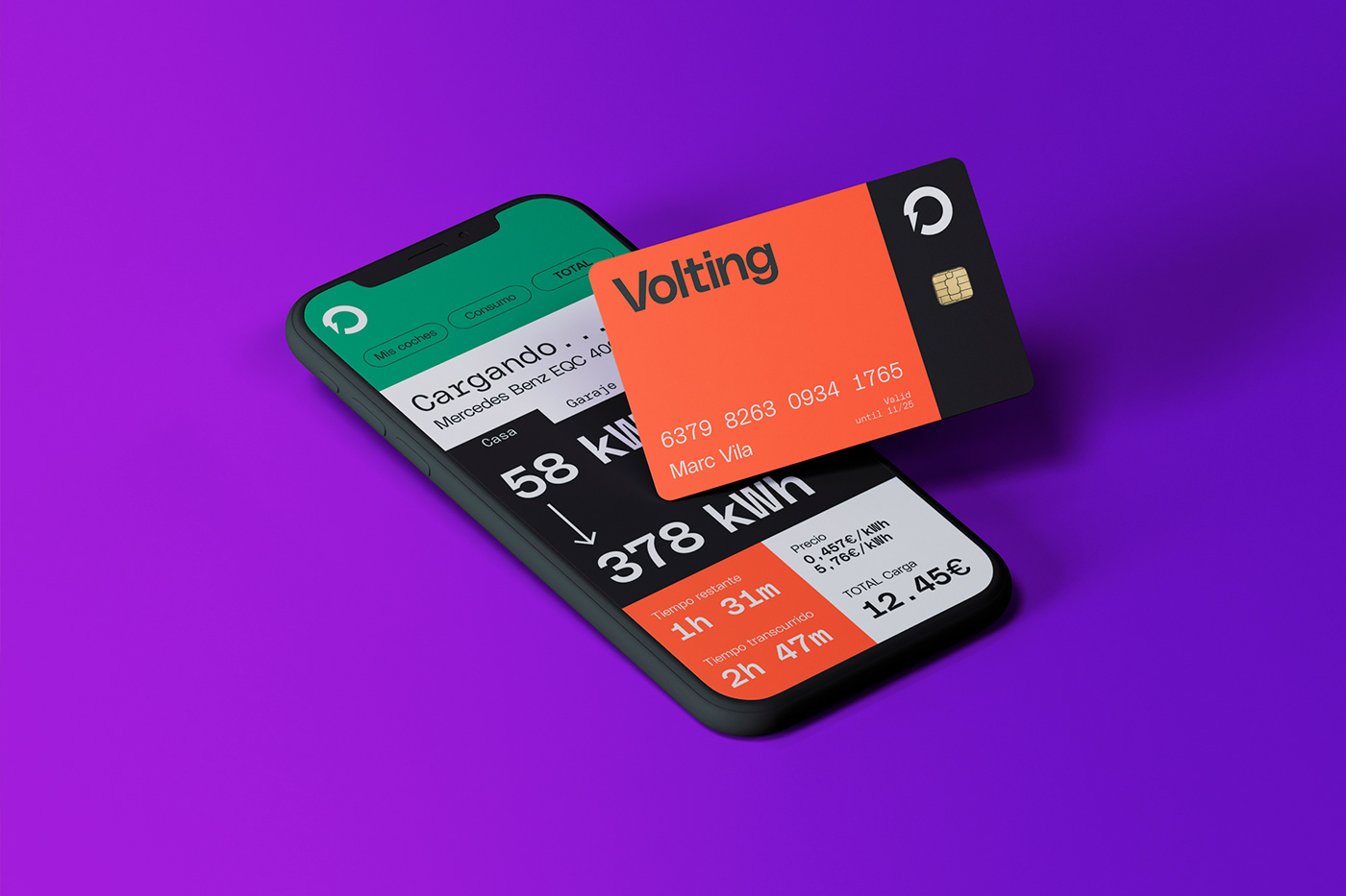
The project requires a name for this new company and the creation of its graphic universe, communication tone and visual language. The idea is to make the transition to electric mobility understandable and accessible and to help to make the different audiences understand how easy it is to choose, customize and install the most suitable electric chargers for each type of vehicle.
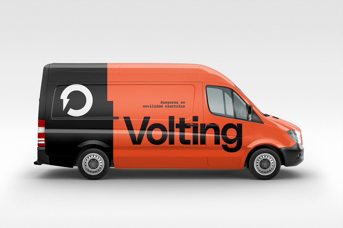
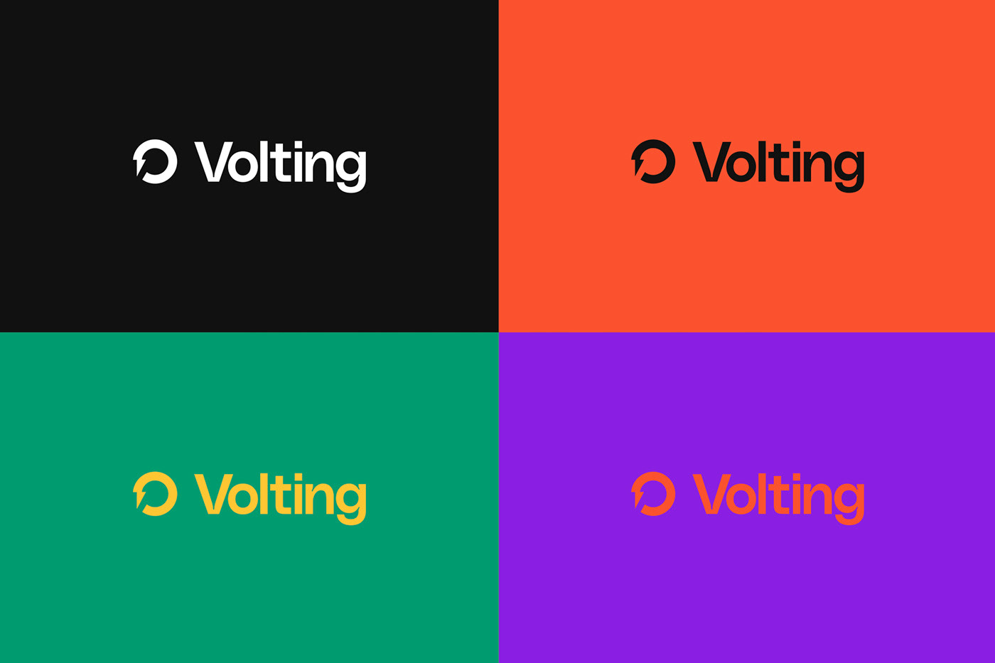
Volting is the naming chosen and comes from the declination of the concept of “volt” linked to the world of electrical energy. A nice and easy to remember name that helps to make this type of energy understandable and close.
The symbol is based on the icon representing an electric lightning bolt and is combined with the shape of the wheel. A logo that connects electricity and the world of mobility in a representative and dynamic shape.


The graphic language of the new brand is based on the representation of roads in the shape of a curve. A silhouette that represents the various roads on which vehicles circulate. We want to focus on the benefit and less on the charger itself.


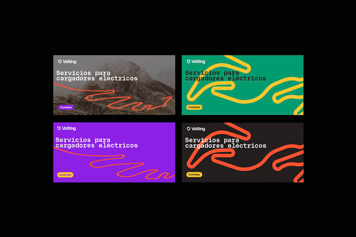

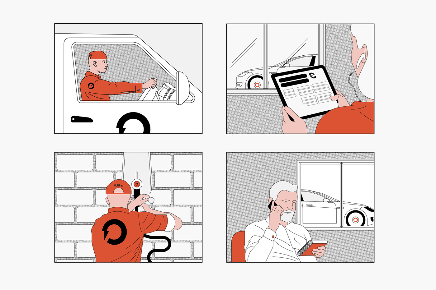
The idea is to combine the landscape and the street where the vehicles circulate to later explain the characteristics of the chargers and the whole process from the moment information is requested until the charger is installed at home. Illustrations created in an instruction manual style and various animated icons help to make the whole process of managing the configuration of your charger more understandable.


For the web design, several objectives and target audiences were taken into account. After a study of keywords and competition analysis as well as a specific SEO analysis, workshops were held to define and structure the different messages according to different types of target audiences. The website experience defines a launching phase focused on three different audiences: private homes, communities of neighbors and companies so we create a global homepage and three specific landings.


Conclusion:
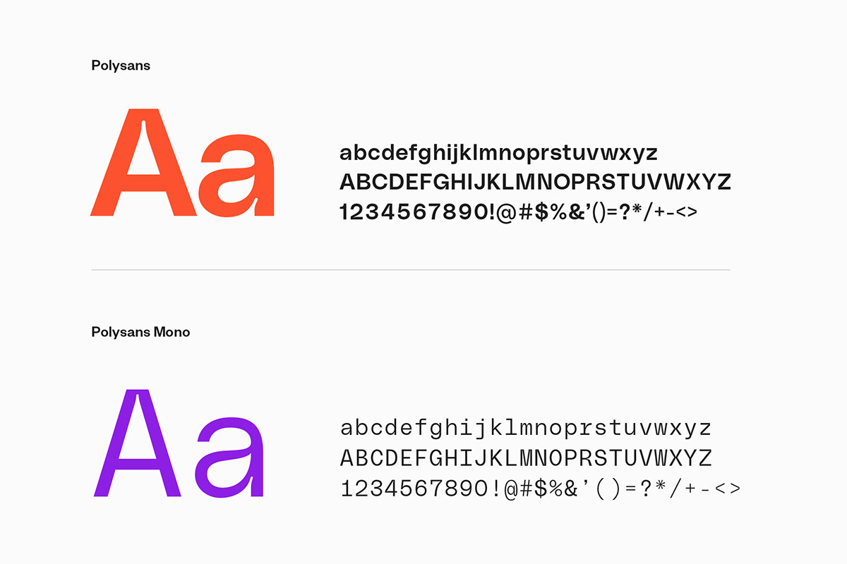
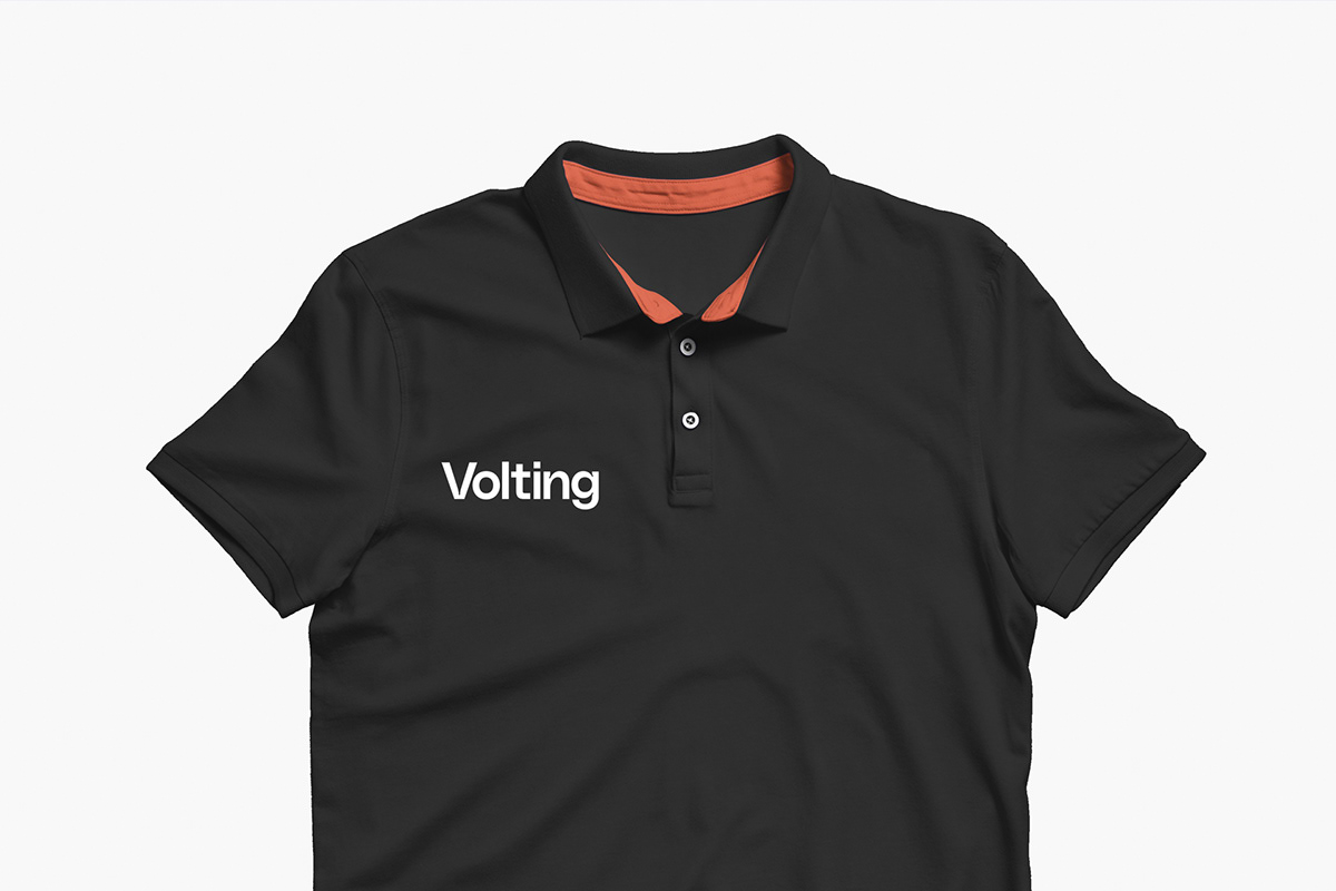
A fresh and young identity that helps to communicate the values of electric mobility and that helps, through the different brand elements, to convey in a functional way the ease of installation of the best charger for the vehicle.